ACE Bakery
Love Every Bite
Love Every Bite
How a branding and omnichannel marketing approach inspired people to fall in love with bread again.
Brand Development & Design
ACE offers a wide range of artisanal loaves, buns and baguettes, bringing freshly baked bread to grocery store bakeries across Canada. However, the brand felt like their brand aesthetic had gone stale, highlighting the versatility of the toppings, leaving bread in the background. ACE tasked us with elevating their branding and omnichannel marketing approach to better reflect their premium price tag and put ACE bread back in the center and at the top of Canada’s grocery lists.
The bread aisle is notoriously... well, boring. A literal sea of beige, filled with traditional displays and the same branding and packaging conventions. With nearly half of shoppers claiming to have increasingly cut back on bread over the past decade, how could ACE help reverse that trend and inspire people to enjoy bread again?
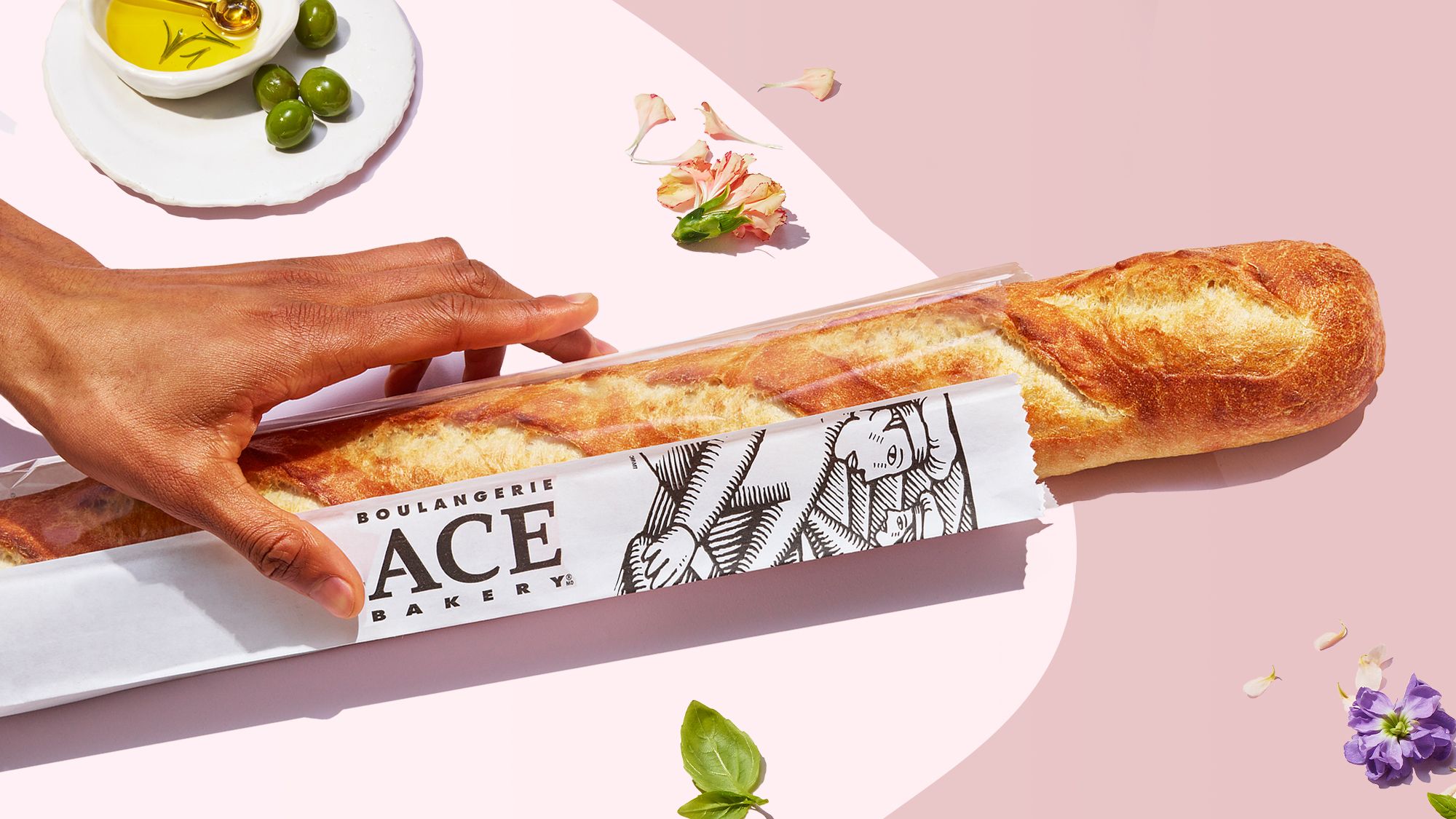
Introducing Love Every Bite, an omnichannel marketing strategy that inspired shoppers to fall in love with bread again.We vibrantly showcased the bread in seasonally relevant, mouthwatering usage occasions to inspire and entice shoppers with a reason to buy right at the point of purchase.
We started with a feeling - romance. We took that feeling and used it as a lens for everything we created for the new branding campaign. First, we put our focus on a new campaign tagline and crafting a brand-line that could speak to our love of bread, consumers’ love of bread and could punctuate every piece of creative in market. We crafted a romantic typeface reminiscent of calligraphy, providing a smooth, warm visual experience that transforms every line of copy into a love letter to bread.
Next was our approach to photography. We highlighted the products through mouth-watering stylized studio photography that featured bright lighting and hard shadows to contrast our dreamy colour palette and evoke the style of nostalgic photos you might send to a loved one.
To further romanticize ACE, we used a modern, minimalistic colour palette to complement each season. We launched the brand identity design campaign with a romantic soft pink for Easter, making a splash in the market with our shelf debut. Our summer visuals featured a fresh, vibrant blue, swapped out for a delicious pumpkin orange for autumn and a rich burgundy for our holiday campaign.
To put our products in the centre of the frame, we created bespoke ACE bread-shaped silhouettes to hug the products, giving them their moment to shine.
RESULTS
The results were impressive. ACE’s new brand identity design sparked an increase of 20% in purchase intent and 2% lift in market share. ACE also saw 34% of total consumption coming from new consumers; proving the ACE Love Every Bite campaign successfully broke through the sea of beige in the grocery store bakery aisle and inspired people to love bread again.